
Colour is one of the most essential elements in web design. The colours you choose for your website can influence everything from user engagement to conversions. Applying basic colour theory principles can help you select an effective colour palette that enhances your brand and attracts your target audience. This guide will briefly introduce colour theory and how to use it for better web design.
The Basics of Colour Theory
Colour theory is a framework for combining colours in aesthetically pleasing ways. It provides guidance on which colours work well together and which ones should be avoided. Some key principles of colour theory include:
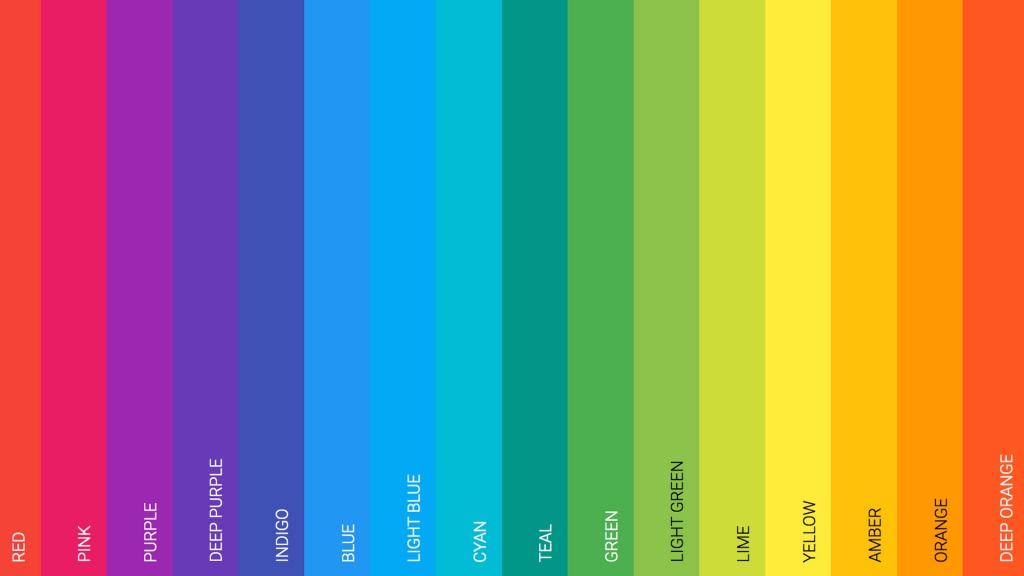
- The colour wheel – This shows how colours relate to each other. Complementary colours that are opposite on the wheel create high contrast, while colours next to each other blend smoothly.
- Colour harmony – Combining colours in certain harmonious ways creates balance. Familiar harmonies include complementary, analogous and triadic.
- Colour context – How we perceive a colour is influenced by surrounding colours. The same colour can look very different depending on what’s around it.
- Colour psychology – Colours evoke emotional responses. Warm colours like red and peach colour code feel energetic, while cool blues and green colour codes are calming.
Understanding these basics allows you to use colour strategically in web design.
Choosing a Primary Colour
The first step is choosing a primary brand or theme colour. This is the dominant shade that will feature heavily throughout your site. Consider what feeling you want your brand to embody and pick a colour that aligns. Bold reds and oranges convey energy, blues and greens feel tranquil, and neutral browns and greys project stability.
Look at competitors, too. Ensure your primary colour stands out from others in your industry. You can find tools online to generate accessible colour palettes around any seed colour.
Selecting a Colour Scheme
Next, build a full-colour scheme that complements your primary brand colour. Simple triadic and tetradic harmonies work well. The triadic scheme uses three colours evenly spaced around the colour wheel. For example, blue, yellow and red. This creates vibrancy but can be jarring.
Tetradic uses four colours in a rectangular formation. This dynamic look suits creative brands. If it’s too bold, mute one colour to 70% to soften the effect. Analogous schemes use adjacent colours like blue, teal and green. These are more subtle and soothing. Avoid accent colours jumping out.
Finally, consider a split complementary scheme. Start with a base colour, then choose the two colours on either side of its complement. This is a slightly more nuanced take on the standard complementary harmony.
Colour Context in Web Design
Colour doesn’t exist in isolation. Other colours surrounding it change how our eyes interpret it. For example, a light grey button on a white background appears lighter than a black one. Adjust colours relative to the palette so nothing looks oddly bright or faded.
Carefully choose foreground and background combos for sufficient contrast. Light text on dark backgrounds provides the best legibility. Automated colour contrast checkers can identify issues. Also, ensure no information is conveyed by colour alone. Use labels, patterns and icons alongside coloured elements. Support colour blindness by never differentiating elements solely by colour.
Putting It All Together
With a primary colour and complementary scheme chosen, apply them to your site. Use the primary brand colour for prominent elements like headers, key buttons and icons. Apply the accent colours more sparingly as highlights on sub-navigation, signposting icons, and interaction cues.
Keep backgrounds neutral and avoid distracting colour clashes. White space helps anchor boldly coloured elements. Introduce colour variations like lighter tints and darker shades. This adds visual interest while retaining cohesion across the palette. But don’t go overboard with endless colours. Stick to one primary and two or three accent colours for simplicity.
Ensure your colour scheme aligns with your brand style. Energetic hues suit vibrant startups, while more muted palettes project professionalism. Test colours thoroughly and check the palette works across all devices.
Applying basic colour theory like the colour wheel and harmonies allows you to assemble professional, aesthetically pleasing palettes. When selecting your primary colour, consider psychology and branding, then construct a complementary scheme.
Ensure sufficient contrast between foreground and background elements. Keep colour variations to a simple, unified palette. Use testing and accessibility checks to optimise your final colour selection. Intelligent use of colour can make all the difference in good web design.